deviantART


Creative Commons License
Some rights reserved. This work is licensed under a
Creative Commons Attribution-Noncommercial-No Derivative Works 3.0 License.
Details
Submitted: March 28, 2008
File Size: 1.6 MB
Image Size: 399 KB
Resolution: 1112×440
Comments: 74
Favourites & Collections: 41 [who?]

Views
Total: 17,353
Today: 19

Downloads
Total: 3,220
Today: 2

Embed


Thumb

Artist's Comments

Suprise!
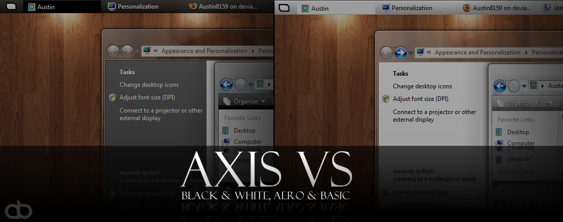
Axis VS for Vista, BETA
Black Aero and Basic Style, and White Aero and Basic Style
Still got some of kinks to work out.
Download for TESTING purposes ;P
Leave Suggestions, requests, bugs, and comments here :)

(Instructions: [link] )

(Problem fixed: re-download)
[x]

Devious Comments

love 1 1 joy 1 1 wow 0 0 mad 0 0 sad 0 0 fear 0 0 neutral 0 0

~xmovingpicturesx:iconxmovingpicturesx: Mar 28, 2008, 4:16:38 PM
It's telling me the visual style could not be applied. It's not a problem with my files, because I've got other visual styles installed.

--
Shed rejection, learn to follow the wolves.
~Austin8159:iconAustin8159: Mar 28, 2008, 4:25:53 PM
I fixed it! Try it again, tell me if it still doesn't work ;P

--
"In the words of the late great Colonel Sanders, 'I'm too drunk... to taste this chicken.'"
~kalel90:iconkalel90: Mar 28, 2008, 4:43:52 PM
Thinner taskbar would be good besides that its looking good.
~Austin8159:iconAustin8159: Mar 28, 2008, 5:06:10 PM
;P

Thanks for the suggestion, man :)

--
"In the words of the late great Colonel Sanders, 'I'm too drunk... to taste this chicken.'"
~Grospolina:iconGrospolina: Mar 28, 2008, 5:07:01 PM
It's nice, but make it more individual. Make something interessesting with the startmenu like Satin. And change the Startbutton. Make it bigger and with a 3D Effect.
~Austin8159:iconAustin8159: Mar 28, 2008, 5:09:02 PM
Thanks for your suggestions :D

--
"In the words of the late great Colonel Sanders, 'I'm too drunk... to taste this chicken.'"
~GhOsT-10:iconGhOsT-10: Mar 28, 2008, 5:45:02 PM
ok, being an admiror of MX and Dragonfly and an admiror of this VS already, here's my two cents:

-don't put too much transparency in it, it looks good as it is, but a little more work will make it perfect
-the taskbar thickness is almost perfect imo, don't change much(just a tintsy tad thinner);)
-please oh please don't make an orb for a start button, although this one needs something I can't quite describe
-consider squared edges as an option,or maybe alternate the round edges with the squared ones, like the start menu symbol
-the start menu looks good, but maybe it should be smaller(if this is supposed to be a minimalistic style than it really should be smaller imo)

and that's it. I'm looking forward to see the final release and use it;)

--
Só me apetece é beber gasolina!!...
...e acender um fósforo
~kalel90:iconkalel90: Mar 28, 2008, 7:45:49 PM
Grospolina<-----------no. hes not trying to make vista more bulky than it already is lol
Also to give you a more accurate measurement than thin id say you should make it 15% thinner.
say its close to 24 pixels high id take it down to around 20-22.
~kalel90:iconkalel90: Mar 28, 2008, 7:47:43 PM
Also dont alternate square and round edges it just looks weird choose one or the other to keep it uniform it just looks much better.
quoting ghost here ->
-the start menu looks good, but maybe it should be smaller(if this is supposed to be a minimalistic style than it really should be smaller imo)
~kalel90:iconkalel90: Mar 28, 2008, 7:48:43 PM
Also i like the current start button lol but whatever suites you is what you should choose/use.
[x]

Site Map